Sate-T Solutions
Brand consultancy
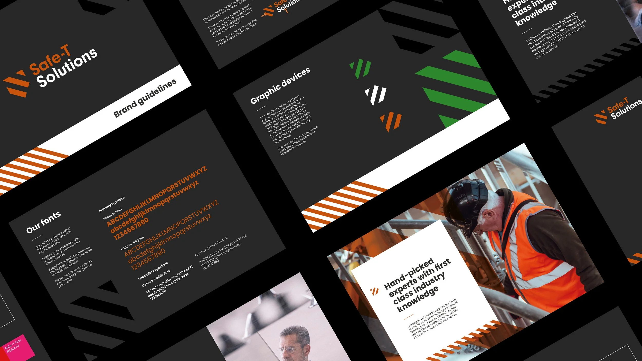
Health & safety experts Safe-T Solutions approached us and our web development partners Webcetera to enhance their brand and web presence.
Working with their leadership team we created a new identity based around a shield symbol made up of hazard warning stripes, also creating a subliminal S within the shield - clever stuff! Using the hazard warning stripes as a graphic device we paired this with an orange and black colour pallet, a mixture of black and white and colour candid, documentary style photography and a to the point tone of voice to create a memorable brand.
A new online home
A bespoke experience
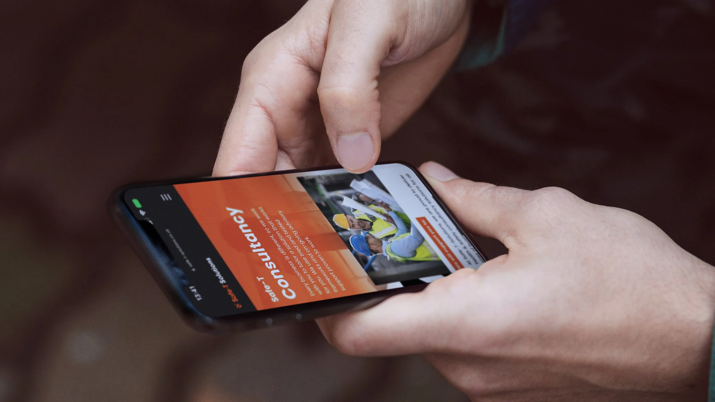
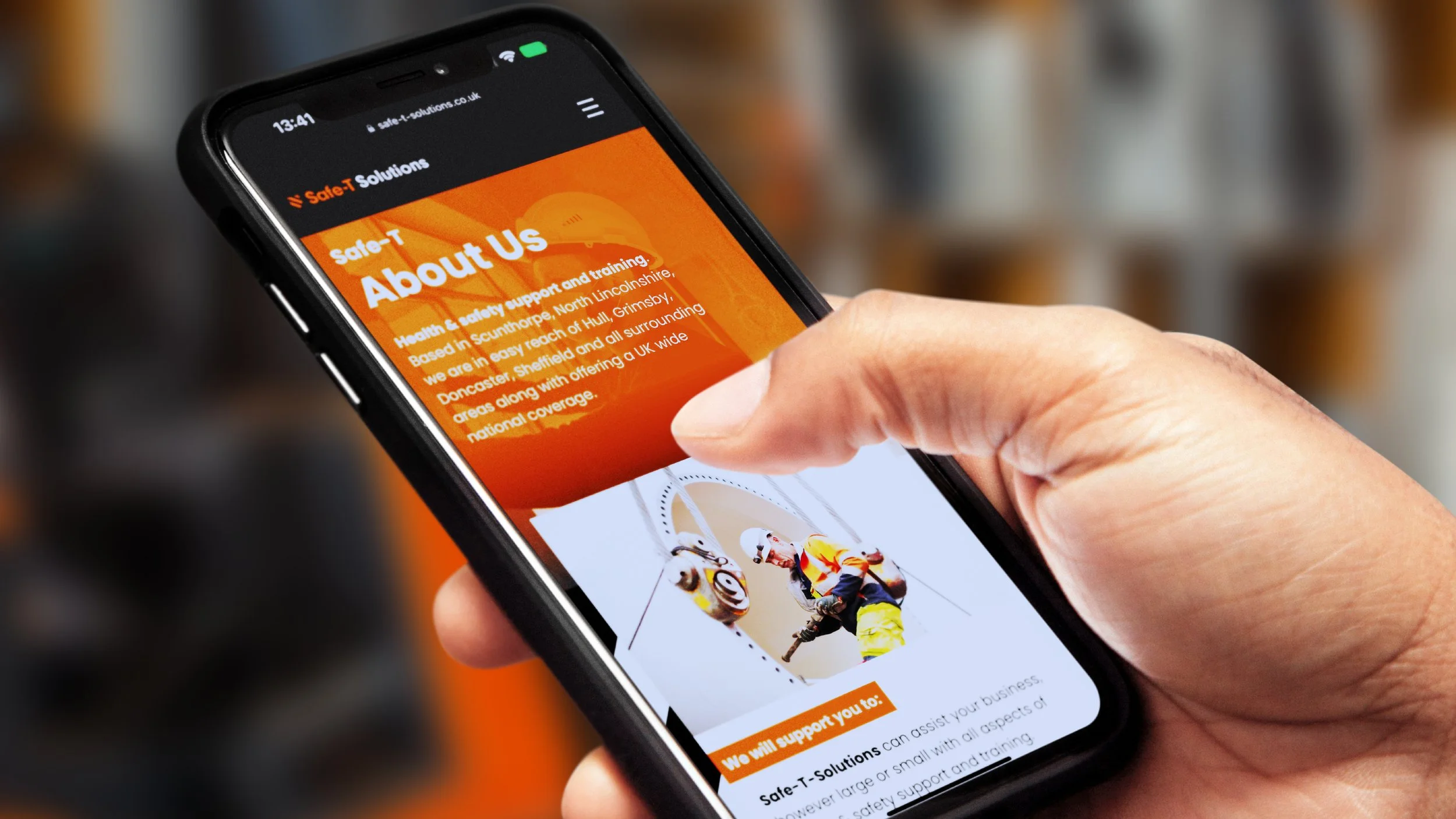
Following the brand refresh the first port of call was an improved web presence. Working with the team at Webcetera we designed a fully responsive, highly accessible website.
A new online home for their business, providing details of their educational courses and consultation expertise ready for new and existing customers to access.


